Brand identity / Retail / Packaging
Snacc’n Smoke
An energetic yellow-and-black convenience retail identity expressed through storefronts, packaging, and outdoor campaigns.
Overview
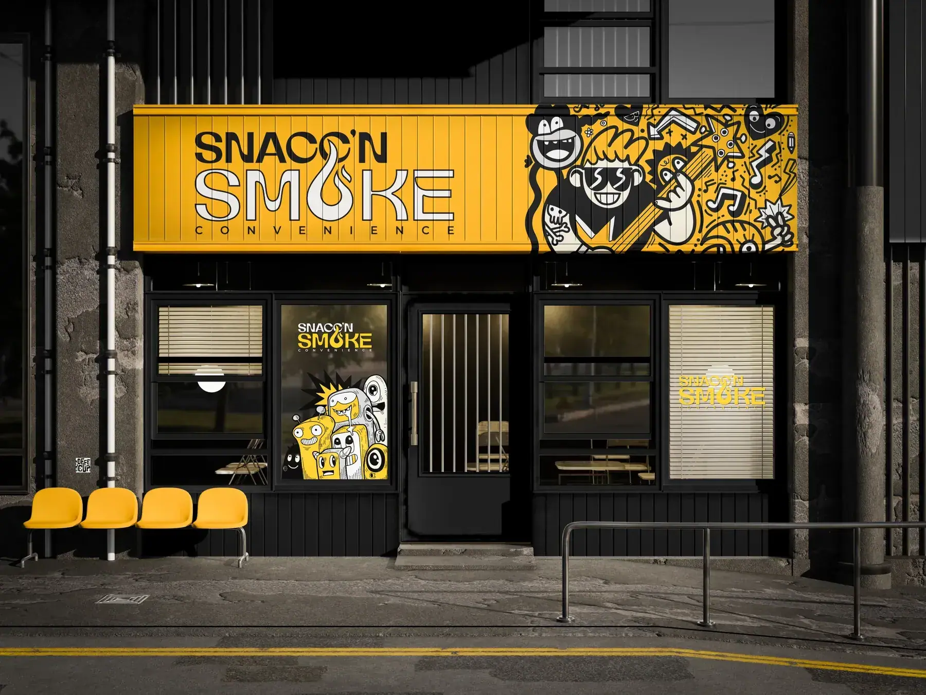
SNACC’N SMOKE CONVENIENCE — a retail identity built for a corner store with attitude: a punchy wordmark with a flame in the O, wavy psychedelic patterns and illustrated characters.
- Discipline
- Brand identity / Retail / Packaging
- Deliverables
- Wordmark
- Storefront
- Cans
- Transit advertising
- Posters
- Packaged product
- Palette
- #F7C51E#0B0B0B#FFFFFF
Challenge
A corner convenience store competes with every other shop on the block. Snacc’n Smoke wanted to feel like a destination with its own attitude, not just another place to grab snacks.
Solution
A loud, yellow-and-black retail identity with a flame in the O, psychedelic wave patterns and illustrated characters that turn the storefront, shelves and campaigns into something people notice and talk about.
Direction
Yellow and black only. Patterns and characters fill large surfaces — a storefront fascia, transit walls, posters, cans — while the wordmark stays simple and legible.
Approach 01
Impossible to miss
A strict yellow-and-black palette makes the storefront and products stand out from the street and the fridge.
Approach 02
Patterns carry the energy
Wavy patterns and characters fill large surfaces like the fascia, posters, cans and transit walls, while the wordmark stays simple and legible.
Approach 03
A brand people take home
Branded cans and merchandise extend the store into products customers keep and share.
Delivered
- 01Wordmark
- 02Storefront
- 03Cans
- 04Transit advertising
- 05Posters
- 06Packaged product