Brand identity / Restaurant / Packaging
Roost & Rice
A warm, character-led restaurant identity spanning packaging, uniforms, and food-led brand imagery.
Overview
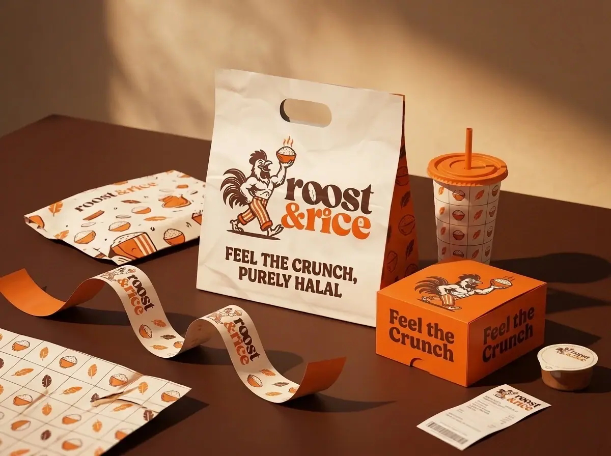
An identity for a restaurant built around a walking rooster mascot and a soft, heavy serif wordmark — applied across takeaway packaging, staff aprons and food imagery.
- Discipline
- Brand identity / Restaurant / Packaging
- Deliverables
- Logo & mascot
- Logo construction
- Takeaway packaging
- Apron
- Food imagery
- Palette
- #5D362E#FE651A#F3E6D8
Challenge
Roost & Rice needed an identity with real personality, something customers remember and recognise across the counter, the takeaway bag and social media, without becoming loud or gimmicky.
Solution
A character-led identity built around a walking rooster carrying a rice bowl, grounded by a soft, heavy serif wordmark and a warm brown-and-orange palette.
Direction
Deep brown #5D362E and a bright orange #FE651A do most of the work. The mascot carries personality; the wordmark keeps it grounded. Packaging uses a repeating pattern of small food icons so even plain surfaces stay on-brand.
Approach 01
A mascot with a job
The rooster carries the brand’s personality and tells the menu’s story, chicken and rice, without a single word.
Approach 02
Warmth through colour
Deep brown #5D362E and bright orange #FE651A feel appetising and homely, and stand out on kraft and cream surfaces.
Approach 03
Never a blank surface
A repeating pattern of small food icons keeps even plain packaging on-brand, from wraps to cartons to the takeaway bag.
Approach 04
Built for staff and service
Aprons, caps and pins carry the identity into the restaurant, so the brand is felt in person as well as in print.
Delivered
- 01Logo & mascot
- 02Logo construction
- 03Takeaway packaging
- 04Apron
- 05Food imagery