Packaging / Product art direction / Campaign imagery
Clove & Pepper Candles
Atmospheric candle imagery and botanical label design shaped around each scent’s character.
Overview
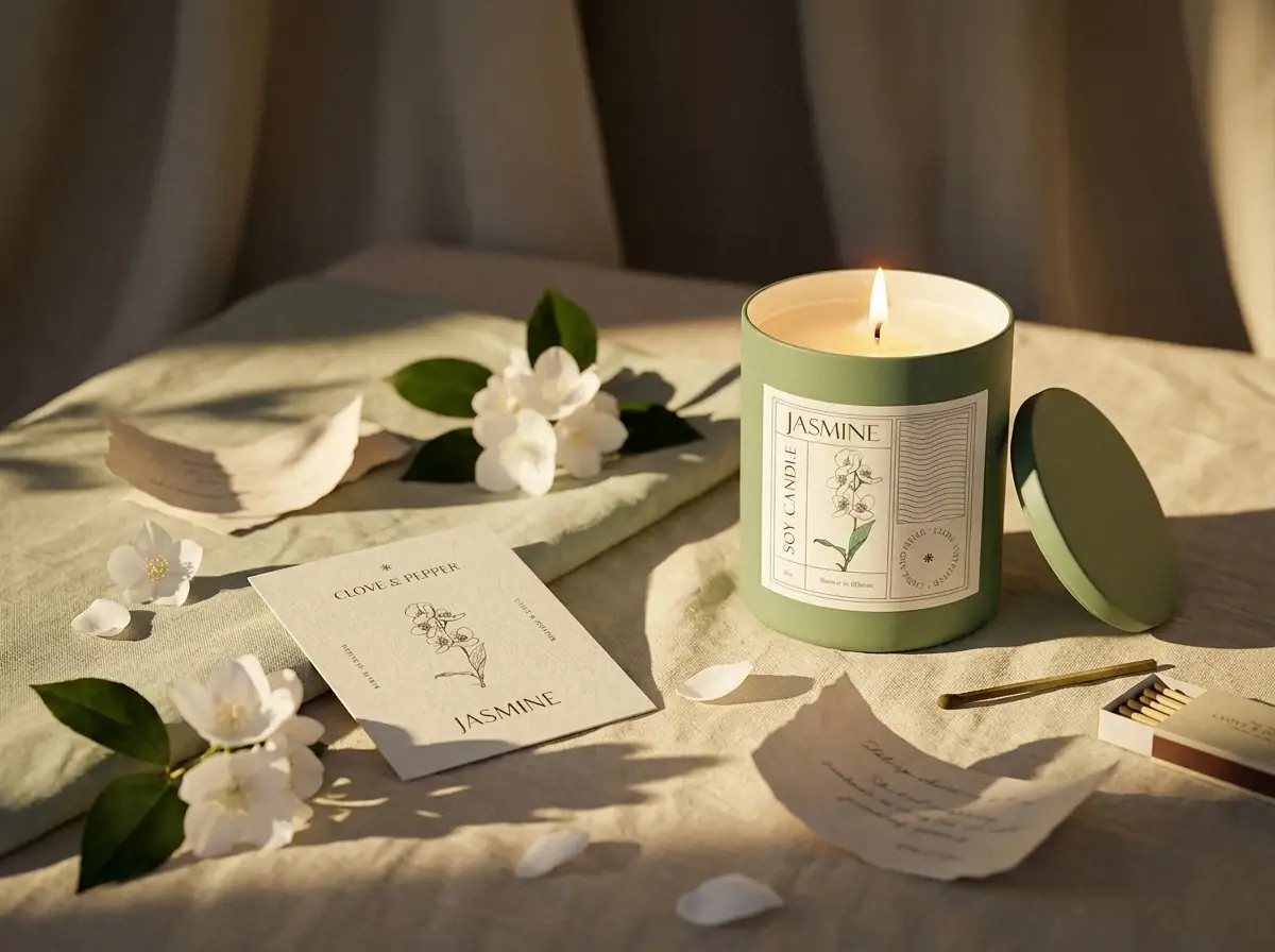
A label system for a soy-candle range, and campaign images that give every scent its own setting — jasmine on a linen-lit table, cherry blossom in a spring meadow, maple in autumn grass, lavender in a dark, smoky still.
- Discipline
- Packaging / Product art direction / Campaign imagery
- Deliverables
- Label system
- Scent labels
- Campaign imagery
Challenge
Clove & Pepper’s soy-candle range needed to feel like one brand on the shelf, while still letting each scent sell its own mood. Scent can’t be shown online, so the packaging and imagery had to do the work of the nose.
Solution
A shared label frame that changes only its botanical illustration and vessel colour per scent, paired with campaign images that give every scent its own setting and atmosphere.
Direction
One shared label frame — vertical “Soy candle”, a panel of waves and a circular Clove and Pepper seal — with a botanical illustration that changes per scent. The vessel colour follows the illustration.
Approach 01
One frame, many scents
The vertical “Soy candle”, wave panel and circular seal stay fixed, so the range reads as a family at a glance.
Approach 02
Illustration as the signal
Each botanical drawing, such as jasmine, lavender, maple or cherry blossom, tells customers the scent before they read the name.
Approach 03
Selling the mood
Campaign imagery places each candle in a matching world, from spring meadows to autumn grass to a dark, smoky still, so customers can almost smell it.
Approach 04
Room to grow
New scents slot into the same system with a new illustration and colour, so the range can expand without redesigning.
Jasmine
Delivered
- 01Label system
- 02Scent labels
- 03Campaign imagery