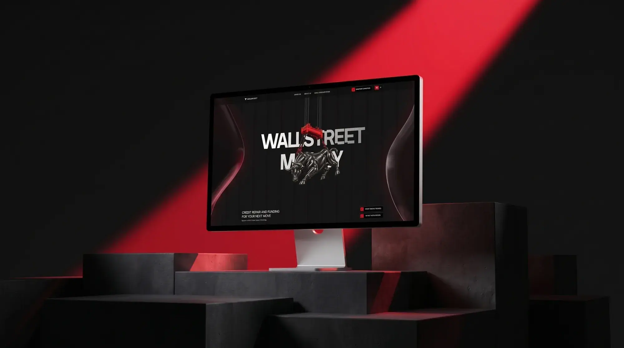
Brand identity / Website / Financial services
Soho Wealth Group
A financial-services website that brings credit repair, personal funding, and business funding into a clear, consultation-led experience.
Visit website (opens in a new tab)
Overview
A visual identity and website for Soho Wealth Group, which offers three related but distinct services: credit repair, personal funding and business funding. The mark — SOHO with a rising bar-chart O — carries from app icon and stationery to the site, where each service has a clear place and one action stays constant: booking a consultation.
- Discipline
- Brand identity / Website / Financial services
- Deliverables
- Logo & construction
- App icon
- Cards & stationery
- Brand applications
- Homepage
- Palette
- #000000#1747FF#FFFFFF
Challenge
Soho Wealth Group offers three services that people often confuse: credit repair, personal funding and business funding. In financial services, visitors arrive cautious. They need to understand quickly which service fits them and trust the company enough to talk to someone. The old presence had no single brand to carry that trust, and no clear route from interest to a conversation.
Solution
A confident identity and a calm, structured website. The SOHO mark, with an O drawn as a rising bar chart, signals growth at a glance. The site gives each service its own clearly explained place and keeps one action constant on every screen: book a consultation.
Direction
The identity sets a bold white SOHO wordmark — the O drawn as a rising bar chart — over deep and electric blues, applied to cards, keycaps, a notebook and an app icon. On the website: black fields, electric-blue light forms and crisp white type. The SOHO mark sits large in the opening screen, so the brand is felt before the details are read. Below, services are laid out as a calm sequence of sections, each with a short heading, a plain-language description and a visible path to a consultation.
Approach 01
One mark, every touchpoint
The bar-chart O works as a full wordmark, an app icon, and a badge on cards and stationery, so the brand reads the same everywhere a client meets it.
Approach 02
Three services, one clear path
Credit repair, personal funding and business funding each get a short heading and a plain-language description, so visitors can pick theirs without help.
Approach 03
Trust through restraint
Black fields, electric blue and crisp white type feel premium and steady. The brand is felt in the first screen, before the details are read.
Approach 04
A constant next step
The consultation call to action stays visible throughout, so whichever service a visitor came for, the next step is always in reach.
Website, section by section
Delivered
- 01Logo & construction
- 02App icon
- 03Cards & stationery
- 04Brand applications
- 05Homepage