Brand identity
NCR Group
A faceted, metallic identity designed to look at home on stone, glass and steel.
Overview
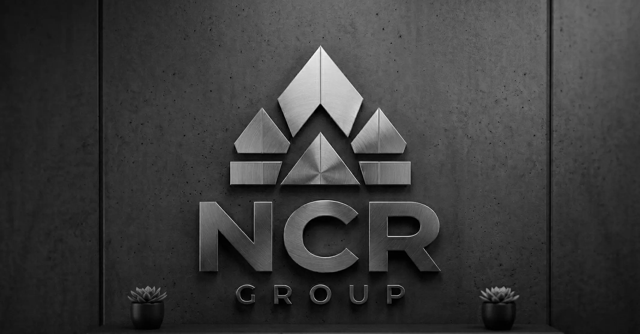
A monochrome brand identity for NCR Group. A stacked, faceted mark sits above a wide wordmark; the system is set in Archivo Expanded and tested on signage, a vehicle and a full stationery set.
- Discipline
- Brand identity
- Deliverables
- Logo and lock-ups
- Construction diagram
- Colour palette
- Typography system
- Signage, vehicle and stationery visualisations
- Palette
- #B5B5B3#D3D3D2
- Credits
- Studio: Createssa Studio
Direction
Two quiet greys, #B5B5B3 and #D3D3D2, and a metallic finish. Archivo Expanded across five weights, from Extra Light to Semi Bold.
Approach 01
Weight without noise
The identity stays strictly monochrome, so form, proportion and material do the talking.
Approach 02
Built on a grid
The mark stacks angular facets into a peaked form, drawn over a meta diagram so every edge relates to the wordmark below it.
Delivered
- 01Logo and lock-ups
- 02Construction diagram
- 03Colour palette
- 04Typography system
- 05Signage, vehicle and stationery visualisations
Presentation board branded Createssa Studio